


Do You Need to Modernise Your Logo?

by Joe
28 April 2022
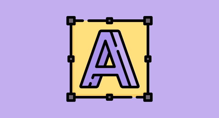
Your logo is to your business what your face is to you. That is, it’s a visual representation of who you are and what you do, and has the power to stick in customers’ and clients’ minds for a long time, or disappear as soon as they look away.
Have you ever noticed how big businesses will recreate and redesign their logo fairly regularly – sometimes with small adjustments and other times with big sweeping changes? More often than not, these changes are not random, but are instead cleverly designed to bring the business and its visual representation in line with their new audience, or to reflect changes to the business.
In this blog we look at the importance of your logo, and then ask the question around modernisation – and whether now could be the time to give your logo the update it deserves.
The importance of your business logo
You only have to look at social media to see how important logos have become in the modern world of online and offline customer experience. From the small circular profile picture on Instagram, to the header banner on Facebook, social media has been built to support logo placement – making it the first thing that users see when they land on your profile. What does this tell you? Your logo should be designed to stand out and reflect your brand in a simple but memorable way.
– Your logo is likely the first thing your customer will see when they first interact with or find you (online or offline), so it needs to stand out but still communicate what you do
– Your logo should make your target customer or client want to learn more about your business
– Like it or not, your logo forms the basis of your entire brand identity, with the colour scheme and font being used across all of your branded material in order to ensure a cohesive and consistent aesthetic
– It should separate you from the competition but still look like it belongs in the same industry
– Your logo has the power to build brand loyalty – with customers seeking your logo in a room or online forum full of competing logos
So, how do you know when it’s time for a redesign or an update? After all, if your logo is working and customers remember it, do you really need to change it?
This depends on your business and your position in the industry. Almost all businesses, aside from a few exceptionally successful ones, need to make aesthetic changes at some point in order to remain relevant and continue to speak to and attract customers. Here’s how to know if your logo needs a redesign – and what to do when it does.
How to know if it’s time for a logo redesign
If a logo redesign feels like a daunting concept, remember this. A redesign doesn’t have to mean that you are changing your brand identity. In fact, in most cases your customer or client base likely won’t even notice the change – especially if you retain the same brand colours and the same business name (and no customer is going to stop buying from you because you changed the font of your logo). And so, it follows that the most important thing to consider is that most logo redesigns are not there to impact your existing customer or client base – rather, the aim is to ensure your business continues to attract new customers and clients.
So, is it time for a logo change?
– Has your competition shifted? If you were once top of the league and are now being hounded by competition or are looking for a little boost that will push you out in front of those pesky competitors, then a logo redesign can give your business an edge and show that you are modern and able to adapt to the ever-changing climate of industry.
– Is your business growing or expanding into new areas? Reflecting internal changes through your logo can be a powerful move, whether that means adding words, taking words away, or changing the graphics to reflect the most accurate representation of your business.
– Does your logo look dated? This is certainly the easiest way of recognising whether or not your business logo needs an update – placing it on different platforms and seeing how it looks against the modern and simple designs of other businesses. While eye-catching once meant bright colours and bold designs, a neutral and simplistic design is now far more likely to garner and entice the 21st century customer.
– Where does your logo appear? Once upon a time, most logos stretched out horizontally because they only sat at the top of paper, across desks, and along the top of a website. Now, logos need to fit inside those circular profile pictures on social media and in all manner of different online placements – and so it follows that logos have been redesigned to fit with this new design specification.
– Consider your audience and the target demographic of your ideal customer. Trends change across different generations, with many businesses finding that small adjustments to their logo enable them to remain relevant for existing customers while also enticing new customers from a new, younger demographic. This means looking at what is on trend as well as taking into account the changing views and values of the next generation – being sure to create and design something that is accessible to all and does not alienate any potential customer groups.
What to do next
Design is just one part of our service offering here at Slate, with our team experts in creating memorable and eye-catching logos and delivering consistent design and quality across each online touchpoint. To discuss your logo and how we could help your business in 2022, get in touch with the team today.

More Insights


Get The Latest Insights, News and Projects from Slate’s Newsletter
